
 Pressbook
All postsHow-to
A seamless Instagram carousel from two to ten photos: one wide canvas, sliced into panels that swipe as a single image. On-device. Save and post as one set.
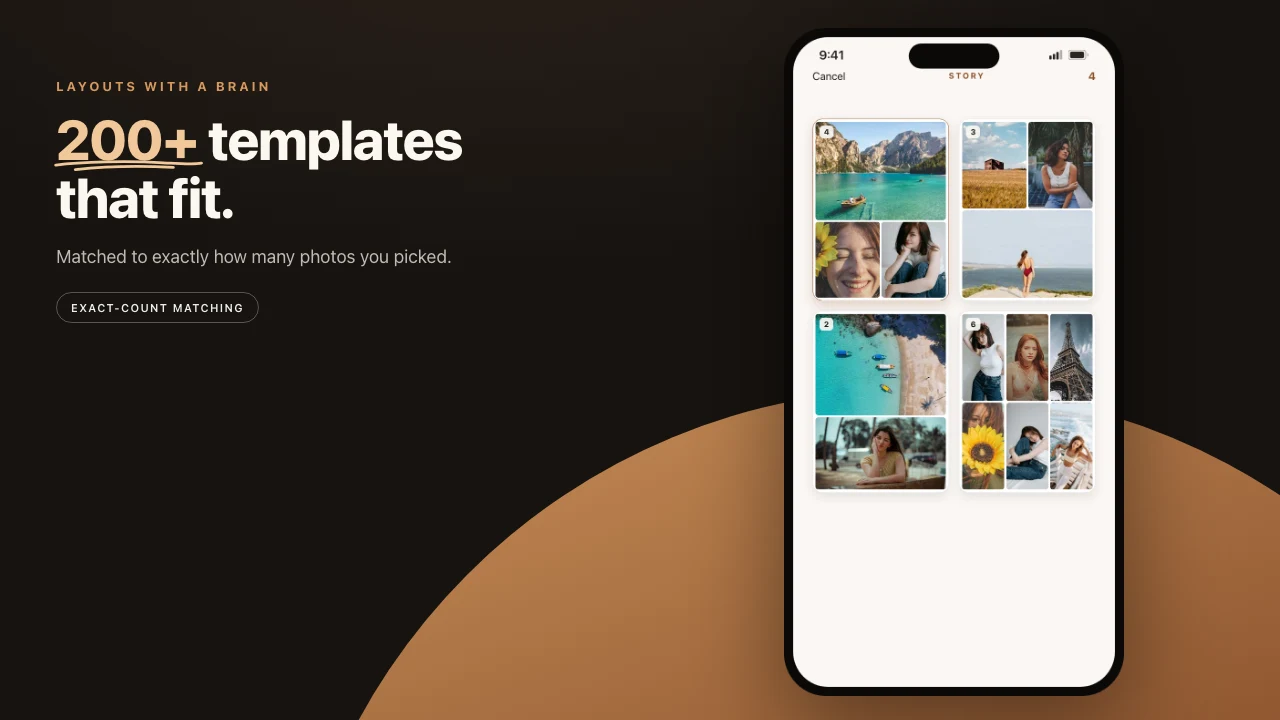
Five photos, one swipe. That is a seamless carousel, and it only works if the five files were born as one design.
Most carousel apps still treat each slide as its own square. You copy a background, hope the type matches, and live with a seam. Pressbook lays the photos across a single wide canvas, then cuts that canvas into panels. The background, the type, and the crops continue across the gap.
The whole path runs on the phone. The photos are not uploaded to be designed.
What a seamless carousel is
A seamless carousel is one wide image posted as several slides. Each slide is a slice of it, so a horizon or a face can cross the edge and line up on the next swipe.
The usual way to make one is by hand. You set up a canvas several slides wide in Canva or Photoshop, drop guides at each cut, export, and run the file through a splitter. Pressbook does the same job on the phone. It builds the wide canvas from the photos you pick, places the cuts, and exports each slide as its own image.
One wide photo works the same way. How to post a panorama on Instagram counts the panels a panorama needs and walks through the steps.
Pick two to ten
A Pressbook carousel is two to ten panels. Two is a before and after. Ten is a sequence that pays off on the last swipe. Shorter sets give each panel more room. Longer sets reward someone who keeps going.
You select the photos. The app composes them with a shared background and type. This is not ten separate posts that happen to sit next to each other.
Why the seams disappear
Pressbook does not design five squares and then try to make them friends. It renders one wide canvas at export resolution, for example 5400 by 1080 pixels for a five-panel square set, then slices that rendering into panels.
Each panel is drawn as its own fresh image, not cropped out of a parent bitmap. Crop-based slices leave gray or black edges. Fresh draws do not. When the width does not divide evenly, the first few panels absorb one extra pixel so the total stays exact and the seams land where they should.
Because every panel is a slice of one render, they share theme and type by construction. There is nothing to drift. When someone swipes, the design continues across the gap instead of resetting.
Square or portrait
Two shapes cover the feed.
- Square. 1:1, 1080 by 1080 per panel. The standard thumbnail.
- Portrait. 4:5, 1080 by 1350 per panel. More vertical space. Better at stopping a scroll.
Pick based on how much of the feed you want each slide to claim. You can reuse the same photos in an album later. The carousel is not a dead end.
Save the set, post once
On export, each panel is its own image. Save all of them to Photos. Upload them together, in order, as one Instagram post. Instagram still accepts multiple images. The maker is whatever built those files well.
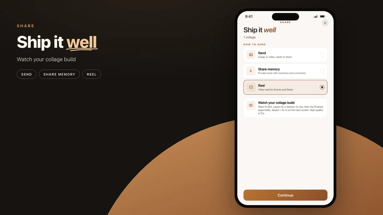
Panels use the same quality tiers as the rest of the app. Archive, on Pro, exports the largest stills. A carousel you built for the feed is sharp enough to print or reuse. Free export is screen resolution with a small watermark.
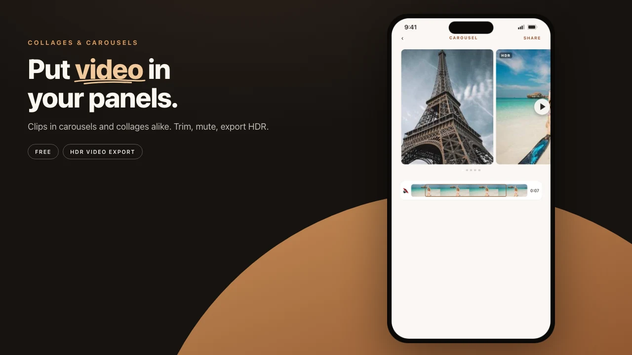
A video slot can sit on the same canvas as stills. That is not the same as a Reel, which is the whole piece rendered as one short video. Use Reel when Stories want motion. Use panel images when the feed wants a swipe.
All of it on the device
Composition, the wide-canvas render, the slice, and the export all happen on the phone. The photos never leave to be designed. Airplane mode is a fair test. If the set still exports, it never needed a design cloud.
Carousel, collage, or album
- A carousel is a set of slides someone swipes through. The design is one horizon.
- Several photos combined into a single image is a collage.
- A long-form sequence of designed pages is a photo book.
If you only needed one composed frame, you wanted a collage, not a two-panel carousel with a lonely second slide. If you keep adding panels because the story will not fit, you wanted a book.
The mistakes that reopen the seam
Designing each slide in a different app, then importing the squares, is how you get five related posts instead of one image. Mismatched backgrounds, type that jumps size, a crop that does not continue. The wide canvas exists so you cannot accidentally do that.
Posting the panels out of order is the other way to break it. Save the set. Check the order. Upload together. Instagram will swipe them in the order you add them.
Stickers and type sit on the shared canvas, so they continue across the swipe the same way the photos do. If a mark stops at the panel edge for no reason, you placed it like a per-slide badge. Move it.
Steps
- Open Pressbook and start a New Carousel.
- Pick two to ten photos. Do not design each slide alone.
- Choose square or 4:5. Place type and stickers on the shared canvas.
- Export the panels to Photos at the quality you need.
- Post them together, in order, as one Instagram upload.
Best Instagram carousel maker apps. Pressbook vs SCRL, 17v28, Crsel and Canva.
Start on iPhone or iPad. Make a carousel. Free, no account, nothing uploaded.